Fylgja - a post mortem
Fylgja - a post mortem
Boring stuff
This game was made in a week for Brackeys Game Jam 2024.2 with the theme "Calm before the storm". The graphical assets where all made in Aseprite, the music was made in Reaper and the sound effects were made SFXR.
The game itself was made in Godot 4.3 (non .NET)
My interpretation of the theme
"Calm before the storm"
I tend to dislike obvious choices and so I decided on a somewhat abstract interpretation and focused specifically on the calm part of the prompt, namely the calm before a war/battle. I looked at various parts of scandinavian and norse folklore and found the concepts of Huginn and Muginn (Odins ravens) as well as Valravn and Fylgja which are both about a raven/birdlike creature that can shapeshift and brings omens of death and battle. (btw, most mythologies have alot of pre- and post-battle omens/creatures, I just happen to be somewhat familiar with scandinavian since I grew up there).
I decided to use the creature, Fylgja, and have the player control it. I quickly grew to like the idea and so I went with it. (sadly you don't have a lot of time to mull over your inital design decision)
I wanted the player to feel like they were stirring something with each warrior they visited. But I didn't want the player to actually to see the end result.
I decided on a 2D platformer (which I kindda regret) for my interpretation for this, as I felt it was easy to implement and it would allow me a greater amount of time to work on music/graphics.
What went okayish?
I'm quite happy with the fly/jump mechanic, I actually want to make a larger game with it. However on reflection, it seems too bouncy for how somber the rest of the game is.
The wall bounce was mainly implemented to prevent the player from just holding right or left the entire time, but force them to think when you should press left or right.
I will concede that the wall bouncing is a bit aggressive and could be toned down without losing much, I think it's the combination with also having to recharge you jump meter when you've landed that's aggravating players. My reasoning was to try and force the player to actually take pause and think before just jumping. (sorta in the vein of Jump King, but I don't think I needed to recharge the jump meter on the ground that slowly)
Something I considered adding was a wind mechanic that would increase in force as the game went on. You can actually see a remnant of this by the animation the Fylgja plays when you press down, it "hunkers" down, which was supposed to be a way to avoid getting carried away by the wind.
I have since making and releasing the game, come up with a different character that fits the game mechanic WAY better, and I'm probably gonna go with THAT instead. (I don't wanna write off the Fylgja tho, so I'm definitely gonna keep it around, in the background)
I do like the design of the Fylgja and I think it's really cute/fun to look at, but I don't know where to go with it as of now.
What went right
Code
Alright so Godot is basically perfect for the movement and controls and collisions. I literally just used the internal methods like move_and_collide and is_on_floor() etc. etc. the one "kindda" odd thing I do is I also use the is_on_floor() to set a was_on_floor boolean variable to handle the liftoff animation. (which are all frame by frame)
It was a breeze handling the animation state with an animationPlayer node and animationtree.
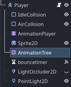
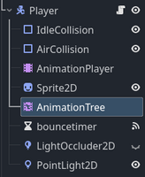
the picture above show the composition of the player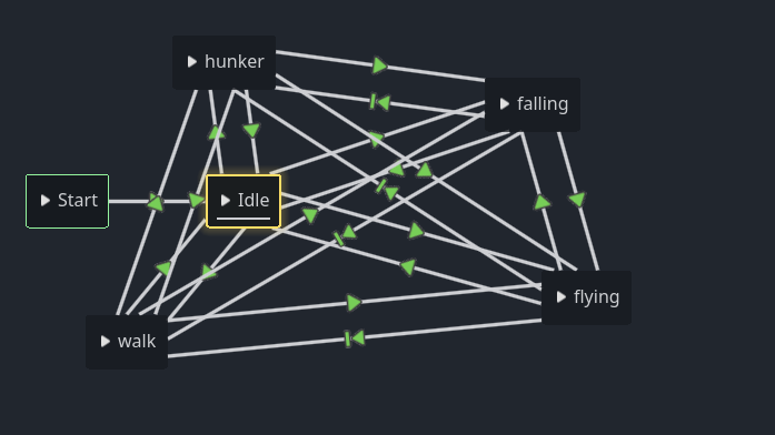
and the animationtree for the player. It looks messy, but it basically means I can turn a state on by setting a condition to true or false.
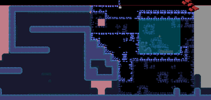
The metroidvaniastyle mapping basically uses a simple Camera2d that snaps to a rectangle of 320x240, that's how it changes levels back and forth (maybe you didn't notice, but you can literally backtrack all the way :P )
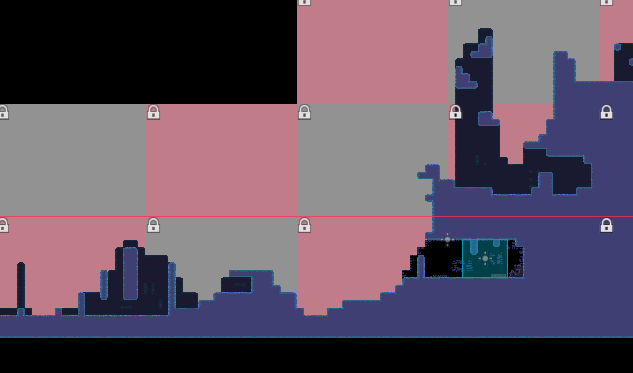

picture above is the entire game map in editor.
It DOES bog down the engine a bit and I'm looking into a different mapping system.
Also fun fact:
the bg is actually locked unto the camera, which is why you can actually make it bug out in game :P
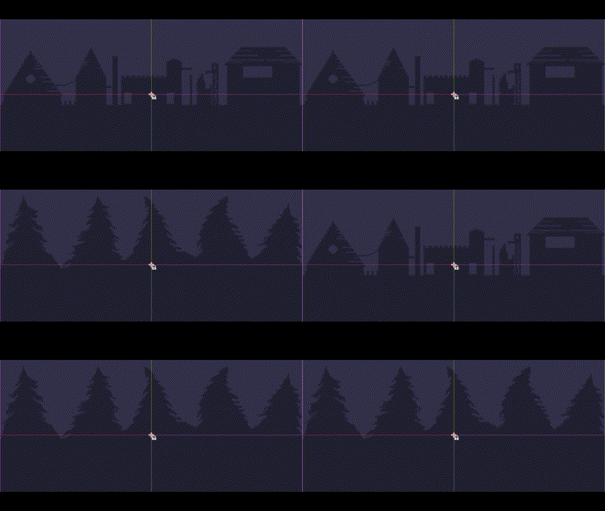
here you can kindda see it changing back and forth a bit wonky.
Music
The music used the new Interactive AudioStreamPlayer. (seriously Godot has HIT!IT!OUT!OF!THE!PARK!)
I'm basically starting out with a simple loop, that I add onto. It's fairly simple and you can hear the song here:
I basically just spliced it up completely, so every additional track would be added on as the player visited more and more warriors.
I have uploaded it here on my NG https://www.newgrounds.com/audio/listen/1362658
Graphics and ambience
The graphics were HEAVILY inspired by NES castlevania and I'm pretty happy with the execution of it. If I had, had time to give it a second pass, I'd definitely work on the visibility of the platforms you can land on.
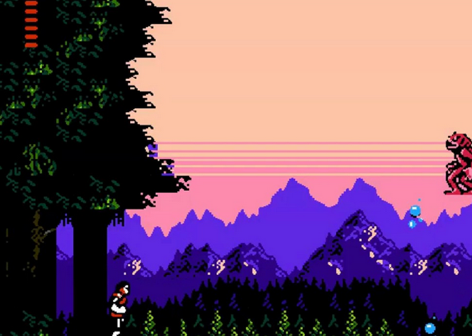
above, Castlevania 2: Simon's quest. below is Fylgja (it's more simple but not completely off)
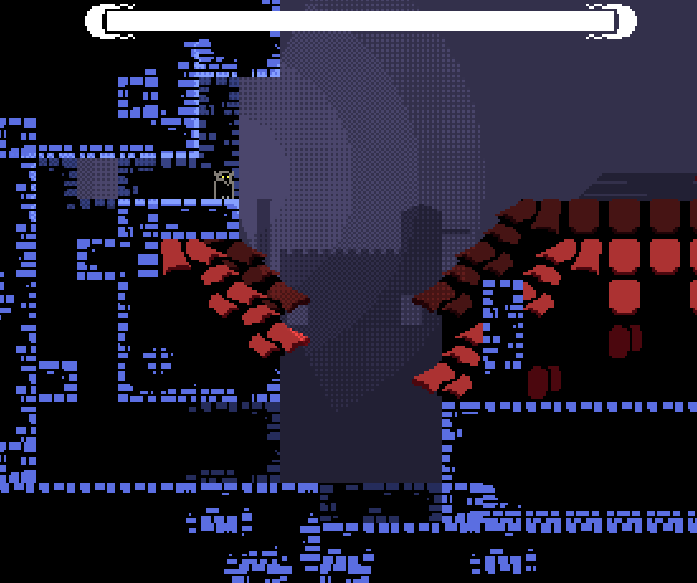
Jesus... that's WAY tooo much black :/
I tried making the starting area, this dark city and the problem was I didn't have time to make any other kind of designs, so I ended up just going "darkness" for the entire game.
I'd probably try and make it with a red/brown palette, and make the player sprite more blue-ish. It definitely could be "popping" more even with dark values like this.
The player sprite and tiles were 16x16 large, HOWEVER, the actual player sprite is a lot more skinny than 16, since it can only be 16 at most. when it's idle it's only 8 pixels wide, and when it flaps its wings, it becomes somewhere between 14 - 16 pixels wide (basically the wings add 2-4 pixels on either side)
Honestly 16x16 or 24x24 is a pretty good sprite size since it forces you to REALLY focus on the actual silhouette.
What went wrong?/did I struggle with?
Well first off, I got sick and lost 1 1/2 day or so :/
Conveyance (or lack thereof)
As per usual, it's VERY difficult for a solo dev to design levels that in any way conveys game mechanics and mood. I tried in some places to add different paths, one that's a bit easier/obvious but slower and one that's a bit more difficult to spot but faster.
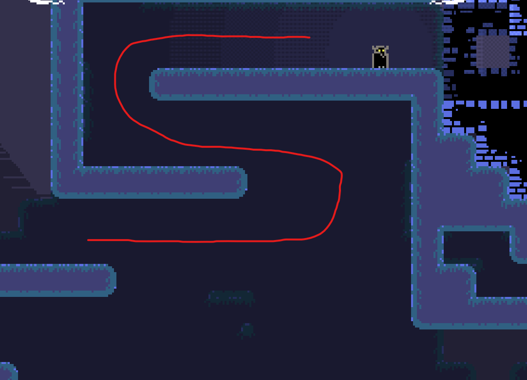
above and below, two different paths to the same goal.
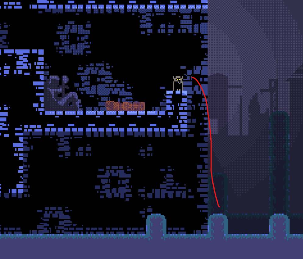
This is also just a question of how much time investment you can expect from players during a game jam rating period. It might not be the smartest to make a very challenging game that demands multiple playthroughs and multiple.
Conveying the theme
I don't think my interpretation of the theme actually came through very well, I do favor subtlety, but the other side of the coin is vagueness, which is what I feel it ended up being.
The few things I use to communicate the rising storm (the music mainly) is not enough. I did try and add an allegorical figure for death/end/fate in the form of the hooded figure, but I still don't think it's quite enough. 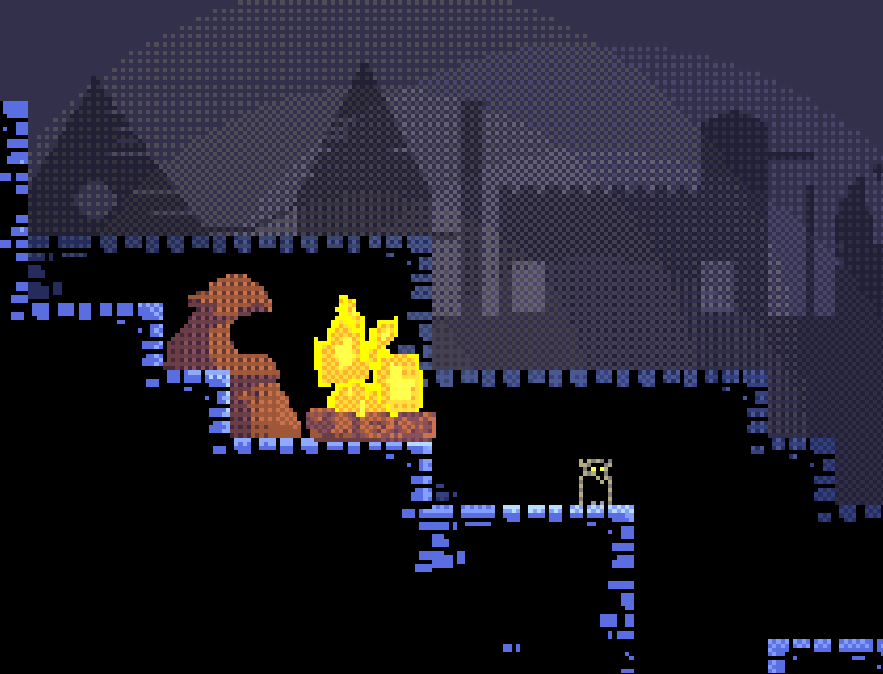
I do wanna say a special thanks to all the people who played, rated and gave me feedback on the game.
And a special thanks Framebuffer and hackerG7 who've both given me some of the kindest and most motivating feedback I've ever received, genuinely thank you!
Also a special thanks to the Brackeys community and the Jamlytics developers and community.
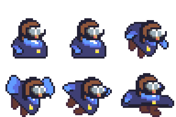
(also here's the figure I'm going to use for my next fly platformer game)
Fylgja
A small challenge platformer game about a spirit awakening warriors for war
| Status | Released |
| Author | Mol |
| Genre | Platformer |
| Tags | 2D, Aseprite, Atmospheric, Fantasy, Godot, Medieval, Pixel Art, Retro, Short, Singleplayer |

Leave a comment
Log in with itch.io to leave a comment.